Table of Contents
ToggleCall of Duty game covers are more than just box art, they’re visual promises of what’s to come. From the gritty military realism of the early 2000s to the cinematic intensity of modern releases, each cover tells a story about the game’s identity and the era in which it was created. Over two decades, these covers have evolved from simple soldier portraits to complex, layered designs that capture the franchise’s DNA. They’ve launched blockbuster pre-orders, sparked debate among fans, and become collectible artifacts for dedicated gamers. Whether displayed on a shelf or shared across social media, Call of Duty covers have shaped how millions of players first experience these games. This guide walks through every major release’s cover art, examining what made certain designs iconic while others remained polarizing.
Key Takeaways
- Call of Duty game covers have evolved from simple military aesthetics to complex, layered designs that serve as visual markers of the franchise’s identity across two decades of releases.
- The most iconic Call of Duty covers, such as Modern Warfare 2 and Modern Warfare 2019, succeed by prioritizing character prominence, strategic color palettes, and thematic alignment with campaign narratives rather than visual clutter.
- Thematic disconnect between cover art and actual gameplay—most evident in Infinite Warfare’s space-based design—can damage player perception and sales before players even experience the game itself.
- Call of Duty covers now function across multiple platforms simultaneously, requiring designers to optimize artwork for retail shelves, digital storefronts, and social media thumbnails at different scales.
- Regional variations and special edition covers demonstrate how publishers tailor visual marketing to diverse audiences and collector communities, extending the cultural significance of cover art beyond mass-market appeal.
- The franchise’s course correction from experimental futuristic designs back to grounded military aesthetics proves that successful Call of Duty game covers reflect what audiences actually want rather than pushing purely experimental directions.
The Early Era: 2003-2007 Covers That Started It All
The original Call of Duty games laid the foundation for what would become the industry’s most recognizable franchise. Their cover art reflects the ambitions of a studio trying to break into a crowded market with something fresh and grounded.
Call Of Duty And Call Of Duty 2: Setting The Standard
The first Call of Duty (2003) featured a straightforward military aesthetic, a soldier in profile against a muted background. It wasn’t flashy, but it communicated the game’s intent: authentic, boots-on-ground combat. The cover was functional, designed to stand out on store shelves alongside Tony Hawk and Grand Theft Auto III sequels. There was no Hollywood drama, no explosive taglines plastered across the front. Just a soldier, ready for war.
Call of Duty 2 (2004) took that formula and refined it. The cover shifted slightly, featuring a more dynamic pose and improved image quality. By this point, word-of-mouth had already established the franchise as something special. The cover didn’t need to work as hard, players were already coming for the game. The design remained grounded in military authenticity, a thread that would run through the franchise for years.
These early covers established a visual language: clean layouts, focus on soldiers rather than explosions, and minimal text. It was the opposite of the over-designed covers that would dominate action games in the late 2000s. This restraint gave the franchise credibility.
Call Of Duty 4: Modern Warfare’s Breakthrough Design
Call of Duty 4: Modern Warfare (2007) represented a turning point, both for the franchise and its cover art. The game moved away from World War II into contemporary warfare, and the cover reflected that shift. “Roach” and other operators dominated the artwork with a level of detail that suggested AAA production values.
The cover featured a soldier in tactical gear, rendered with cinematic quality that matched the game’s campaign intensity. The color palette shifted from the muted browns of WWII covers to cooler tones, silvers, blacks, and military grays. The composition felt modern without abandoning military authenticity.
What made MW’s cover work was context. Players already knew Modern Warfare was groundbreaking, its campaign was revolutionary, and multiplayer had taken competitive FPS gaming to new heights. The cover didn’t need to sell the game on novelty alone. Instead, it communicated confidence. This is what elite tactical combat looks like. And for millions of gamers who’d spent hundreds of hours in multiplayer, that cover became iconic.
The Modern Warfare Trilogy: When Cover Art Peaked
The Modern Warfare trilogy (2007-2011) represents the franchise’s artistic high point. These covers aren’t just marketing materials, they’re visual representations of gaming culture at its peak.
Modern Warfare 2 And Modern Warfare 3: Bold Military Aesthetics
Modern Warfare 2 (2009) featured “Gary Sanderson” (Roach) in full tactical gear, set against a stark, desaturated background. The composition was almost theatrical, a lone soldier against the chaos of modern warfare. The cover communicated stakes and intensity without resorting to explosions or unnecessary graphic design elements.
The color grading was crucial. Unlike the vibrant covers of most action games, MW2’s cover used muted tones that made the soldier stand out. The typography was minimal, letting the imagery speak. When players picked this up in stores, they weren’t buying a cartoon action game, they were buying a military thriller.
Modern Warfare 3 (2011) escalated the cinematic approach. “Yuri” (Makarov’s operative) appeared in combat stance, more dramatic than MW2’s cover but equally grounded. The composition suggested narrative urgency, a character in the middle of something dangerous. The background hinted at urban destruction without becoming cluttered.
What separated these covers from competitors wasn’t complexity, it was restraint. In an era when game covers were getting busier and more digitally manipulated, Modern Warfare trilogy covers trusted the strength of their central figure and color palette.
Why These Covers Dominated Gaming Culture
The Modern Warfare trilogy covers succeeded because they understood their audience. Competitive gamers and casual players alike recognized these covers immediately. They weren’t just marketing, they were statements. When someone saw the MW2 or MW3 cover, they knew what game that was.
These covers also benefited from timing. The Xbox 360 and PS3 generation was obsessed with military shooters. Call of Duty was the king, and the covers reflected that dominance. The imagery became shorthand for “the best FPS on the market.”
Beyond that, the covers captured something essential about multiplayer gaming culture. The focus on individual soldiers reflected how players saw themselves, elite operators, not cannon fodder. The stark color palettes matched the competitive intensity of multiplayer modes. These covers understood their audience at a deeper level than most game marketing.
Black Ops And World At War: Dark And Atmospheric Designs
While Modern Warfare dominated the spotlight, Black Ops and World at War created their own visual identity, darker, moodier, and rooted in historical conflict rather than contemporary warfare.
The Black Ops Series Visual Identity
Call of Duty: Black Ops (2010) introduced a distinctly different aesthetic. The cover featured “Alex Mason” in shadow, with an emphasis on espionage and covert operations rather than standard military combat. The design was grittier, think 1970s CIA thriller rather than modern tactical combat.
The color palette was crucial. Where Modern Warfare used military grays and silvers, Black Ops embraced darker tones, blacks, deep blues, and blood reds. The typography was also different, sharper, more angular. The overall effect was menacing, suggesting the game’s focus on classified missions and moral ambiguity.
Black Ops II (2012) continued this trend. “David Mason” appeared on the cover in a more contemporary setting, but the dark aesthetic remained. The sequel added neon and holographic elements, suggesting the game’s near-future setting without abandoning the franchise’s grounded roots.
Black Ops III (2015) and Black Ops IV (2018) pushed further into futuristic territory, with robotic augmentations and sci-fi elements visible in the cover artwork. Yet they maintained the Black Ops visual signature, darkness, intensity, and a focus on individual operatives rather than squadrons.
What set Black Ops covers apart was willingness to differentiate from Modern Warfare. While MW covers were about tactical confidence, Black Ops covers suggested danger and uncertainty. Black Ops players weren’t elite soldiers, they were shadows, operatives working in moral gray zones.
Classic WWII Aesthetics In World At War
Call of Duty: World at War (2008) took the franchise backward chronologically but forward artistically. The cover featured soldiers in WWII gear against a devastated European landscape. The design was more chaotic than MW covers, explosions, rubble, and multiple soldiers filled the composition.
The choice to return to WWII was partly nostalgia-driven, but the cover design reflected respect for the historical setting. Instead of treating WWII as mere backdrop, World at War’s cover embraced the scale and brutality of the conflict. The color palette was warmer than Modern Warfare’s, browns, golds, and the orange of fire.
World at War’s cover design influenced later WWII games in the franchise. It established that WWII Call of Duty games didn’t need to look sleek and modern, they could be gritty and historical. This distinction helped when later games like WWII (2017) returned to the setting. Players recognized the WWII aesthetic on the cover and knew what type of experience they were getting.
The Ghosts Era And Infinite Warfare: Experimental Covers
The 2013-2016 period saw Infinity Ward and Treyarch push Call of Duty’s cover art in experimental directions. Some worked. Others became cautionary tales about overthinking design.
Ghosts And Advanced Warfare: Futuristic Soldier Designs
Call of Duty: Ghosts (2013) marked a tonal shift. The cover featured “Logan Walker” in skull-faced tactical gear, distinctive, but also divisive. The design was sleeker than previous covers, with futuristic elements suggesting exoskeletons and advanced tech. The color palette shifted to cooler, more synthetic tones.
Ghosts’ cover tried to be edgy and modern, but many gamers found it overwrought. The skull facepaint, the oversaturated colors, the busy composition, it felt like the franchise was trying too hard to be cool. Compared to the restrained elegance of MW2’s cover, Ghosts looked cluttered.
Call of Duty: Advanced Warfare (2014) doubled down on this approach. “Jack Mitchell” appeared in exoskeleton armor, with the cover emphasizing technological advancement over military authenticity. The design was visually striking, the exoskeleton looked genuinely futuristic, but it signaled the franchise moving away from grounded gameplay.
What’s interesting in retrospect is how these covers reflected real gameplay shifts. Advanced Warfare introduced wall-running and jetpack mechanics that split the community. The futuristic cover perfectly captured player anxiety about the franchise moving too far into sci-fi territory. The art wasn’t wrong, it was honest about where the game was going.
Infinite Warfare’s Polarizing Space-Based Artwork
Call of Duty: Infinite Warfare (2016) took the futuristic direction to its logical extreme. The cover featured “Captain Reyes” against a backdrop of orbital space stations and futuristic spacecraft. It was undeniably impressive artwork, technically proficient and visually unique.
But it was also controversial. The space setting felt disconnected from what Call of Duty players wanted. The franchise had built its reputation on grounded military gameplay, and here was a cover promising interplanetary warfare. The backlash was swift. Infinite Warfare became the most disliked Call of Duty reveal in franchise history, and the cover was partially to blame.
The lesson from Infinite Warfare’s cover: artwork can’t save a concept that disconnects from the franchise’s core identity. No matter how polished the cover is, if it promises something players don’t want, marketing fails. In hindsight, Infinite Warfare’s cover stands as a monument to how far Infinity Ward strayed from what made Call of Duty special. Within a few years, the franchise would course-correct back toward modern and vintage military aesthetics.
Modern Warfare Reboot And Cold War: Contemporary Aesthetics
After the space-faring disasters of the late 2010s, Call of Duty needed to realign itself with what players actually wanted. The reboot era proved that returning to foundational concepts, both in gameplay and aesthetics, was the right call.
2019 Modern Warfare’s Grounded Military Realism
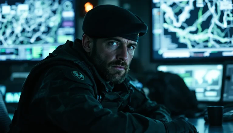
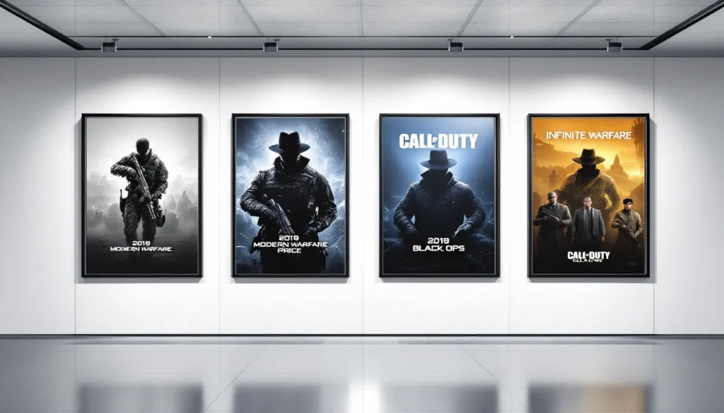
Call of Duty: Modern Warfare (2019) was a franchise reset. The cover featured “Captain Price” and other Task Force 141 operators in a composition that echoed the original Modern Warfare trilogy but with contemporary production values. The design was instantly recognizable, military operators, tactical gear, focused composition.
What made MW 2019’s cover successful was confidence. After years of experimental designs, the franchise wasn’t apologizing for going back to basics. The cover communicated: “We know what works. Here it is again, but better.” The cinematography was crisp, the operators looked elite, and the color palette returned to the military authenticity that defined Modern Warfare’s original run.
The cover also benefited from Captain Price’s return. His iconic skull-and-crossbones balaclava was instantly recognizable to series veterans. Newcomers saw a badass military operator. Everyone won. This is expert marketing, using nostalgia without feeling retro, blending familiarity with modern production quality.
Black Ops Cold War: Retro And Contemporary Blend
Call of Duty: Black Ops Cold War (2020) took a different approach. Treyarch leaned into the Cold War aesthetic, retro color grading, 1980s fashion, and a focus on iconic operators from throughout Black Ops history. The cover featured multiple operatives in a composition that suggested a spy thriller.
The design choice was brilliant. Cold War’s cover didn’t try to be cutting-edge modern, it deliberately embraced analog, retro aesthetics. The color grading looked like it could be from a 1980s action film. The typography nodded to Cold War-era propaganda posters. This wasn’t accidental, it was thematic alignment between cover art and game setting.
Cold War’s cover also represented Black Ops’ commitment to seasonal content and battle pass cosmetics. Future covers would feature rotating operators, reflecting the live-service nature of the game. The franchise was learning that cover art could evolve post-launch, updating to reflect seasonal themes and new operator releases.
Both MW 2019 and Cold War demonstrated that audiences wanted Call of Duty to return to recognizable military settings. The covers reinforced that message. After years of space stations and exoskeletons, players craved grounded warfare aesthetics. The covers sold that vision effectively.
Modern Warfare II, Warzone 2, And Beyond: The Current Generation
The current generation of Call of Duty covers reflects the franchise’s evolution into live-service gaming, cinematic storytelling, and platform-agnostic design. These covers need to work across physical media, digital storefronts, and social media simultaneously.
2022 Modern Warfare II’s Cinematic Cover Design
Call of Duty: Modern Warfare II (2022) brought the Modern Warfare reboot into its sequel era. The cover featured Task Force 141 operators in action poses, with more dynamic composition than MW 2019. The design emphasized teamwork and squad-based gameplay, showing multiple soldiers working in unison.
The visual aesthetic continued MW 2019’s grounded military approach but added cinematic flair. The lighting suggested dramatic moments from the campaign, explosions in the background, urban warfare settings. The color grading was warm and intense, contrasting cool tactical gear against orange and red environmental lighting.
What’s notable about MW2’s cover is how it plays across formats. On a store shelf, the composition catches the eye. On a phone screen or social media, the key elements remain readable. The cover designers understood that most players would encounter this artwork digitally first, then potentially on physical media. The design hierarchy worked at every scale.
The cover also featured Captain Price prominently, reinforcing his status as the franchise’s symbolic leader. By 2022, Price wasn’t just a character, he was Call of Duty’s mascot. The cover’s focus on him communicated continuity and player familiarity.
Warzone 2 And Seasonal Cover Updates
Call of Duty: Warzone 2 (2022) introduced a concept newer to franchise marketing: seasonal cover updates. While the base cover featured Task Force 141 operators, seasonal updates throughout the live service cycle featured different characters, operators, and thematic elements.
This reflected how live-service games operate. The base cover had to appeal broadly, but seasonal covers could highlight limited-time operators and themed events. A Halloween season might feature spooky operator skins. A crossover event might show licensed characters. The cover art became dynamic, evolving with the game’s content calendar.
This approach presents both opportunities and challenges. Dynamic covers keep the game feeling fresh and responsive to current content. But they also mean there’s no single iconic cover image for Warzone 2, instead, there’s a rotating gallery of promotional art. Some players love this evolution. Others miss the simplicity of a single, definitive cover image.
The current generation’s cover approach reflects broader changes in how games are marketed and consumed. Physical media matters less. Seasonal content matters more. Covers need to work as phone thumbnails as much as retail boxes. Call of Duty’s design team has adapted impressively, creating covers that function across all these contexts while maintaining visual consistency and franchise identity.
For players diving into Call of Duty Black Ops maps and competitive multiplayer, these covers represent more than box art, they’re visual entry points into communities and competitive scenes that have sustained Call of Duty for two decades.
What Makes A Great Call Of Duty Cover
After examining two decades of cover art, patterns emerge. Certain design principles separate iconic covers from forgettable ones. Understanding these principles explains why some covers resonate while others flop.
Character Prominence And Storytelling
The best Call of Duty covers prioritize the human element. Whether it’s Captain Price, Roach, or an ensemble squad, successful covers feature recognizable operators in compelling poses. These characters aren’t just soldiers, they’re protagonists with backstories and agency.
Compare Modern Warfare 2’s iconic cover, featuring Roach in a clear, dynamic pose, with Ghosts’ skull-faced operator cover. Both show tactical soldiers, but MW2’s cover suggests narrative urgency and character focus. You want to know who this person is and what they’re doing. Ghosts’ cover prioritizes aesthetic edge over character storytelling. The result is visual noise rather than narrative clarity.
Great covers also balance individual character focus with team dynamics. Modern Warfare II 2022 shows this balance perfectly, Captain Price dominates, but Task Force 141 operators surround him. Players see themselves represented in the ensemble while recognizing the campaign’s leader.
Color Palettes And Visual Hierarchy
Color choices communicate tone and setting instantly. Modern Warfare’s cool grays and silvers suggest contemporary tactical operations. Black Ops’ darker palettes suggest espionage and moral ambiguity. World at War’s warm browns and oranges root the game in historical WWII settings.
Visual hierarchy separates great covers from mediocre ones. Successful covers guide the viewer’s eye strategically. MW2’s cover uses contrast, a lit operator against a desaturated background, to create focus. The viewer’s attention lands immediately on the central character. Poor covers scatter visual weight evenly, creating confusion about what matters.
Typography matters more than most designers admit. The best Call of Duty covers use minimal, legible text that doesn’t compete with imagery. Conversely, covers cluttered with fonts, taglines, and promotional text feel amateurish. The franchise learned this through iteration, early covers had more text: modern covers trust the image to speak.
Reflecting Campaign Themes And Settings
The strongest covers thematically align with campaign narratives. World at War’s cover communicated WWII brutality through chaotic, explosive composition. Black Ops’ darker aesthetic matched espionage storytelling. Modern Warfare’s clean, tactical design reflected the campaign’s focus on precise military operations.
Covers that ignore thematic context feel disconnected from gameplay. Infinite Warfare’s space-based cover promised cosmic warfare, which many players didn’t want. The disconnect between visual promise and gameplay experience damaged the game before players even opened the box.
Successful covers telegraph gameplay and tone without explicit explanation. Players should understand what experience awaits based purely on visual design. If the cover suggests grounded military combat, multiplayer shouldn’t feel like an arcade game. If the cover emphasizes futuristic tech, campaign should showcase advanced warfare concepts. Thematic consistency between cover and content builds trust.
Regional Variations And Alternate Cover Art
Call of Duty’s global reach means covers aren’t one-size-fits-all. Different regions receive different artwork, reflecting cultural preferences and marketing strategies. Understanding these variations reveals how sophisticated modern game marketing has become.
How Different Regions Get Unique Artwork
Publishers often create region-specific covers based on market research and cultural preferences. A cover that dominates in North America might flop in Asia. Chinese markets have specific preferences about imagery, colors, and symbolism. European markets sometimes prefer different operator compositions.
For example, some Call of Duty releases featured different operator lineups on covers across regions. What appeals to Western audiences, specific soldiers, particular tactical gear aesthetics, might not resonate in other markets. Publishers invest in research to understand these preferences, then commission regional cover variations.
These variations aren’t always visible to international players. Unless you specifically sought out Japanese or Korean cover art, you’d see your regional version as “the” cover. But for collectors and devoted fans, hunting down regional variations has become part of the hobby. Reddit threads and gaming forums feature extensive discussions comparing covers across territories.
The digital era has complicated this strategy. When games are purchased digitally, regional covers become harder to carry out. A digital store might display one cover globally. Physical retailers, but, still receive region-specific stock, making regional variations relevant for collector’s editions and physical game purchases.
Special Edition And Collector’s Cover Designs
Special editions provide opportunity for premium cover designs. Collector’s editions of Modern Warfare II, Black Ops Cold War, and other recent titles feature alternate artwork, often featuring different operators, more elaborate compositions, or premium materials.
Special edition covers often prioritize aesthetics over marketability. A standard edition cover needs to sell the game to casual players. A special edition cover can be more experimental, targeting dedicated fans who already know the franchise. Some special editions feature metallic finishes, embossed elements, or alternative compositions that wouldn’t work on mass-market shelves.
Ultimate editions and premium versions typically receive deluxe cover treatments. These become collector items, valued not just for game content but for physical presentation. Gaming communities actively trade and discuss these special covers, with some becoming sought-after items years after release.
The trend reflects broader understanding that physical media isn’t disappearing, it’s fragmenting. Mass-market players buy digital copies with no physical cover. Collectors purchase premium physical editions with elaborate artwork. Publishers cater to both audiences with different cover strategies, maximizing appeal across market segments.
The Impact Of Call Of Duty Covers On Gaming Marketing
Cover art doesn’t exist in a vacuum. These images drive pre-orders, generate discussion, and shape first impressions. Understanding cover art’s marketing impact reveals why publishers invest heavily in design quality and strategic composition.
Why Cover Art Drives Pre-Orders And First Impressions
Cover art is often a consumer’s first encounter with a game. Before watching trailers or reading reviews, they see the cover image. That single image, whether on a store shelf, digital storefront, or social media, determines whether they investigate further.
Research in game marketing consistently shows cover appeal correlates with pre-order rates. An ugly or confusing cover depresses interest. An iconic, compelling cover drives engagement. The Modern Warfare trilogy’s covers are case studies in marketing effectiveness. Each cover generated immediate recognition, strong sales numbers, and cultural penetration. Millions of players saw those covers and thought: “I need to play that.”
First impressions shape everything. A player who buys a game based on a compelling cover arrives with positive expectations. Conversely, a player disappointed by a cover before even purchasing carries that skepticism into the game itself. Bad covers create negative momentum that exceptional gameplay can struggle to overcome.
Physical retail has declined, but cover art remains important in digital spaces. A game’s storefront image on PlayStation Network, Xbox Game Pass, or Steam is essentially a digital cover. The same design principles that worked on physical boxes apply to digital thumbnails. Successful covers work at thumbnail scale, with clear focal points and readable design elements.
Fan Reactions And Cover Art Controversies
Call of Duty covers regularly spark fan discussion and debate. Some spark genuine excitement. Others ignite controversy that overshadows game reveal. Understanding why certain covers generate passionate responses reveals deeper truths about gaming communities and visual marketing.
Infinite Warfare’s cover backlash is the franchise’s most famous example. The space-based artwork became emblematic of fan dissatisfaction with the game’s direction. But the cover itself wasn’t poorly designed, it was visually competent. The problem was thematic disconnect. Players saw that cover and rejected the promise it made.
Ghosts’ skull-faced operator cover also generated debate. Some players found it edgy and cool. Others thought it looked try-hard and inauthentic. The divided response reflected genuine disagreement about the game’s direction. The cover perfectly captured that tension.
Recent covers have generally received positive reception. Modern Warfare II 2022’s cover appeals to series veterans and newcomers alike. Captain Price’s return generates nostalgia. The tactical composition appeals to competitive players. Broad positive reception suggests the design team nailed the tone.
Fan reactions also extend to diversity and representation debates. Communities discuss operator selection, gender representation, and inclusivity in cover designs. These conversations reflect broader gaming industry discussions about representation. A cover featuring female operators might generate both enthusiasm from inclusive-minded players and resistance from conservative communities. These debates are real, sometimes contentious, but indicate covers matter culturally beyond pure marketing.
Social media amplifies cover reactions. A controversial cover generates thousands of tweets within hours. Fan artists create response artwork. Reddit threads debate design choices. Covers have become cultural artifacts worth discussing, not just marketing tools. This engagement, positive or negative, keeps Call of Duty relevant in gaming conversations year-round.
For competitive players analyzing gameplay mechanics, understanding operator loadouts requires knowledge of the games themselves. Whether exploring Call of Duty WWII Zombies or studying Mastering Call of Duty battle tactics, the covers represent visual entry points into these deeper gaming experiences. The aesthetics communicate tone and setting that influences how players engage with content.
Conclusion
Call of Duty covers have evolved from simple soldier portraits into sophisticated marketing assets that blend artistic ambition with commercial strategy. The franchise’s cover art history mirrors its gameplay evolution, from grounded military authenticity to experimental futurism and back again.
The most iconic covers, Modern Warfare 2, Modern Warfare 2019, Black Ops, succeeded because they understood their audience and communicated clearly what players could expect. They balanced aesthetic sophistication with accessibility. They used color, composition, and character focus strategically. Most importantly, they didn’t try too hard.
The covers that failed or generated controversy often prioritized novelty over clarity. Infinite Warfare’s space aesthetic promised a direction players didn’t want. Ghosts’ skull imagery felt forced rather than earned. These covers teach important lessons about the dangers of overthinking design.
Looking forward, Call of Duty’s cover strategy will likely continue evolving with live-service models. Seasonal variations and operator rotations suggest covers will become less monolithic, more dynamic. Physical media’s decline means covers function primarily as digital assets. Designers will optimize for phone screens and social media as much as retail shelves.
What won’t change is cover art’s fundamental importance. First impressions matter. Visual communication influences purchasing decisions. A great cover generates excitement and discussion. A poor cover creates friction before gameplay even begins. Call of Duty’s two-decade history proves that cover art isn’t peripheral, it’s central to how games find audiences and build communities.
Whether you’re a competitive player tracking updates across platforms, a collector hunting regional variants, or simply someone who appreciates gaming aesthetics, Call of Duty covers deserve recognition as important cultural artifacts. They’ve shaped how millions of players encountered gaming’s biggest franchise. They’ve become iconic images worth studying and discussing. And they’ll continue evolving as the franchise adapts to new technologies and audience expectations.