Table of Contents
ToggleA killer thumbnail can be the difference between a thousand views and a hundred thousand. In the sprawling world of Call of Duty content, where thousands of channels compete for attention on YouTube and streaming platforms, your thumbnail is often the first, and sometimes only, impression potential viewers get. It’s not just an afterthought or a quick design slapped together five minutes before upload. A well-crafted Call of Duty thumbnail is a visual promise: it tells viewers exactly what they’re about to watch and gives them a compelling reason to click. Whether you’re creating highlights, guides, patch breakdowns, or montages, understanding thumbnail design isn’t optional anymore. It’s core to growing your channel. This guide walks through everything you need to know, from design fundamentals and technical specs to proven strategies that successful creators are using right now in 2026.
Key Takeaways
- A well-designed Call of Duty thumbnail directly impacts click-through rate (CTR) and channel growth, with strong thumbnails multiplying views and visibility through improved engagement signals.
- High contrast colors (bright yellows, reds, electric blues), bold sans-serif fonts with outlines, and the rule of thirds composition are essential design fundamentals that make thumbnails readable at small sizes across all devices.
- Feature recognizable operators (Ghost, Captain Price, Roze) and meta weapons (XM4, AK-74, GPMG-7) prominently, and match facial expressions to video tone—confident for guides, excited for highlights—to communicate instant emotional value.
- Use the exact specifications of 1280×720 pixels (16:9 aspect ratio), keep text within safe margins (20 pixels from edges), export as JPG at quality 80-90%, and test on mobile before upload to ensure optimal display.
- A/B test thumbnail variations by changing one element at a time, track CTR performance (aim for above 6%, exceptional at 8%+), and document results to identify patterns in what drives clicks and watch time.
- Consistency in fonts, color palettes, and layout styles across your channel makes it instantly recognizable and builds trust, while avoiding common mistakes like cluttered designs, unreadable text, and clickbait can protect long-term viewer retention.
Why Call Of Duty Thumbnails Matter For Your Gaming Channel
Click-through rate (CTR) is the invisible metric that determines whether your video reaches 100 people or 100,000. A weak thumbnail kills CTR. A strong one multiplies it.
YouTube’s algorithm prioritizes engagement signals, and CTR is one of the biggest. When your thumbnail stands out in the search results or recommendations, more people click. More clicks mean more watch time, better ranking, and more visibility. It’s a compounding effect. Creators who invest in thumbnail design see measurable increases in both views and subscriber growth.
Beyond metrics, thumbnails are part of your brand identity. Think of it like your channel’s first handshake with a viewer. A consistent, professional thumbnail style makes your channel instantly recognizable in a crowded feed. Viewers scrolling past 20 gaming thumbnails should be able to spot yours in a heartbeat. That visual consistency builds trust and familiarity, both crucial for retention.
Call of Duty specifically is a hypercompetitive space. The game has massive esports audiences, tons of content creators, and a culture of constant patching and balance updates. Your thumbnail needs to communicate instantly: “This is worth your time.” Whether it’s a new meta loadout, a clutch play, or breaking down the latest season, the thumbnail has maybe two seconds to convince someone to click before they scroll past.
Successful creators don’t treat thumbnails as an afterthought. They’re deliberately designed, tested, and iterated on. That’s not an accident, that’s a strategy.
Essential Design Principles For High-Converting Thumbnails
Color Theory And Contrast
Color is the first thing the eye catches, and it’s doing heavy lifting in a small 1280×720 pixel space. High contrast is your best friend. Bright yellows, vibrant reds, and electric blues pop against darker backgrounds and cut through the visual noise of YouTube recommendations.
Yellow and red are psychological triggers, they evoke urgency, excitement, and importance. That’s why you’ll see them in so many viral thumbnails. Complementary colors (opposite on the color wheel) create visual tension that draws the eye. Pairing a vivid blue with warm orange, or cyan with red, creates dynamic energy.
One practical rule: if your thumbnail looks muddy or blends together when you squint at it from across the room, it needs more contrast. Test your colors at small scale before finalizing. Remember that not all viewers have perfect monitors, some are on mobile, some have screen glare. High contrast thumbnails survive these conditions.
For Call of Duty specifically, the franchise colors (black, white, and gold accents) provide a solid foundation. But don’t rely entirely on those. Add a pop of color that contrasts: bright orange for an explosion, electric green for emphasis, or neon pink for high-energy moments.
Typography And Text Hierarchy
Text on a thumbnail needs to be instantly readable at thumbnail size. If you can’t read it clearly when the thumbnail is 200 pixels wide, it’s too small or too thin. Use bold, sans-serif fonts. Avoid thin or script fonts, they disappear on screen.
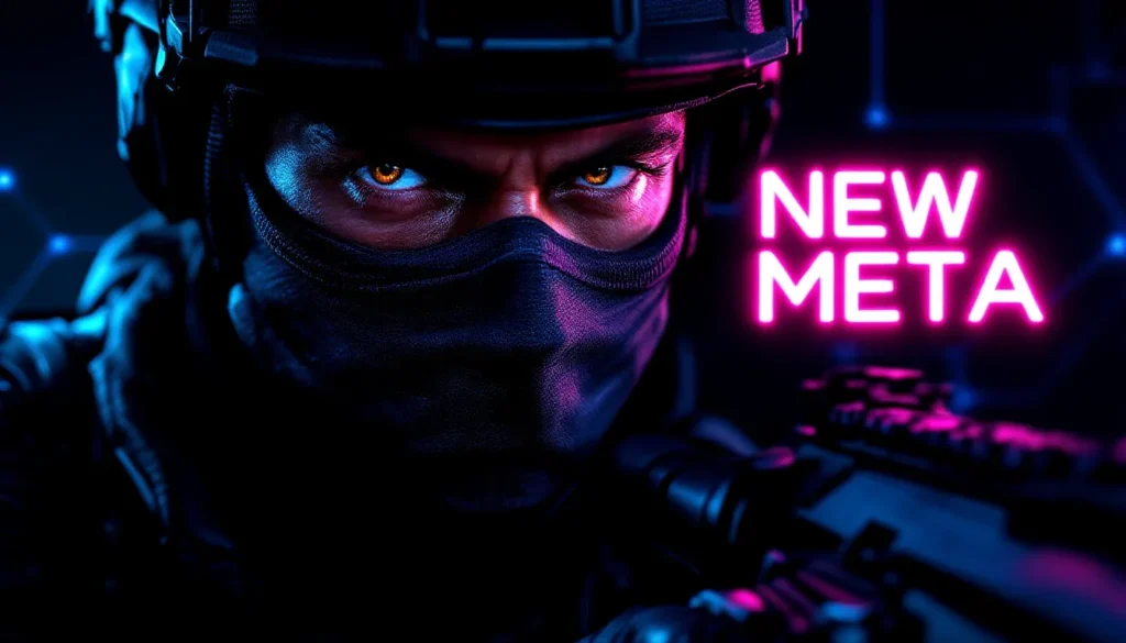
Hierarchy matters. What’s the most important word? That should be the largest. Use size, weight (bold vs. regular), and color to guide the eye. A common layout: large main text (headline), smaller supporting text (subtitle or stat). Examples: “NEW META” (large, bold, contrasting color) over “XM4 LOADOUT” (slightly smaller, secondary color).
Text placement is critical too. Avoid putting text directly in the center where faces or key assets live, place it in corners or edges. White text with a dark outline reads well over any background. Black text with a white or light outline also works. The outline (sometimes called a “stroke” or “shadow”) is what makes text readable over busy backgrounds.
Limit yourself to 3-5 words maximum on a thumbnail. More than that and it becomes clutter. The goal is clarity, not explanation. Viewers should understand the core message in under two seconds.
Composition And Visual Balance
Composition is the arrangement of elements, faces, weapons, text, and effects, into a pleasing, readable whole. The rule of thirds is a foundation: divide the frame into a 3×3 grid and place key elements along those lines or intersections. This naturally creates visual interest and balance.
Eye movement matters. You’re guiding the viewer’s attention with your layout. Usually, the eye enters from the left and moves right, so place your most important element (a face, a weapon, text) where you want attention first. Secondary elements follow.
Don’t overcrowd. Empty space (negative space) isn’t wasted, it’s strategic. It makes busy elements stand out and prevents the thumbnail from feeling chaotic. A clean layout with breathing room beats a packed one that overwhelms.
Asymmetrical balance often feels more dynamic than perfect symmetry. One large element on the left with smaller elements scattered on the right creates visual flow. This is especially useful for Call of Duty thumbnails where you might feature an operator on one side and text or weapon graphics on the other.
Use layers thoughtfully. Background, mid-ground, foreground, each should serve a purpose. A blurred game screenshot as background, a sharp operator or weapon in the foreground, and bold text overlaid creates depth and visual interest.
Character And Asset Selection Strategies
Choosing Recognizable Operators And Weapons
Operators are the faces of Call of Duty. Some have immediate recognition value, Ghost, Captain Price, Roze, and Nikto are instantly identifiable even at small sizes. If your video is about a specific operator or meta, featuring them on the thumbnail is a no-brainer. Viewers searching for guides or gameplay featuring those characters will connect immediately.
Weapons matter too. The XM4, AK-74, and GPMG-7 have become meta staples in recent seasons. If your content is about loadout optimization or weapon comparisons, the weapon graphic should be prominent and clearly identifiable. Use high-quality in-game renders or professional assets, not blurry screenshots.
Consider freshness though. New operators and seasonal weapons create curiosity. If there’s a newly released operator or a just-buffed weapon, featuring them signals that your content is current and relevant. This is especially important for patch notes videos and meta update coverage.
Mix recognizable assets with custom visual elements. A popular operator paired with an eye-catching explosion effect, glowing text, or a bold background creates a unique thumbnail that’s both familiar and fresh.
Using Emotions And Expressions Effectively
Faces communicate emotion instantly. A shocked expression, a confident smirk, or an intense stare conveys the energy of the video. If using operator skins with visible faces, choose renders that match the content’s tone. A guide should feel authoritative (confident expression). A crazy highlight should feel chaotic (shocked or excited expression).
Not all skins have clear facial expressions, some are masked or heavily armored. In those cases, rely on body language. A weapon held at ready conveys action. Arms raised conveys victory. Leaning forward conveys intensity. Use the whole figure to communicate energy.
Expressions also trigger emotional response in viewers. Shock or surprise makes people curious (“What happened?”). Confidence signals authority (“This person knows what they’re talking about”). Victory or triumph signals entertainment value (“This is going to be fun to watch”).
If you’re featuring a streamer or content creator alongside the gameplay, their expression and energy matter enormously. A genuine, energetic expression outperforms a stiff or neutral one. This is where personality becomes part of your brand, viewers start associating your excitement with quality content.
Technical Specifications And Dimensions
YouTube Thumbnail Requirements
YouTube’s technical specifications are non-negotiable. The standard dimension is 1280×720 pixels (a 16:9 aspect ratio). This is what displays across all devices, desktop, mobile, TV, and embedded players. Design at this exact size, not a smaller scale that you’ll enlarge later. Working at full resolution ensures you catch details and readability issues early.
The minimum width is 640 pixels. Anything smaller and YouTube will use a lower-resolution version. You’re already working at optimal size, so this is just a guideline for edge cases.
File size matters too. YouTube accepts JPG, GIF, and PNG formats. Keep file sizes under 2MB to avoid upload issues. Most design tools export at reasonable sizes automatically, but if you’re optimizing manually, aim for 200-500KB for best balance between quality and load time.
Don’t create at a different aspect ratio thinking you’ll crop it later. Thumbnails viewed on different devices get cropped differently. Design intentionally within the 16:9 frame, keeping critical elements away from the extreme edges. Leave about 10% margin on all sides as a safe zone.
A subtle but important detail: safe text area. Text should never touch the very edge of the frame. On mobile, the thumbnail is smaller and edges get cut off. Keep text and important elements at least 20 pixels from the edge.
File Formats And Export Settings
JPG is the most common format for thumbnails. It compresses well, maintains quality, and uploads quickly. Use JPG unless you specifically need transparency (then use PNG).
When exporting from design software (Photoshop, Figma, Affinity Design), use these settings: RGB color mode (not CMYK), 8-bit depth, quality set to 80-90% (higher quality but still efficient file size). Don’t over-compress (quality below 70%) or you’ll see visible artifacts, especially in gradients and skin tones.
If you’re using templates or AI tools, download at maximum resolution, then resize if needed for upload. Never start with a low-resolution template and scale up, that causes pixelation and blurriness.
Batch exporting is a time-saver if you’re creating multiple thumbnails. Set up your export presets once and apply them to all files. This ensures consistency across your channel’s visual style.
Test your exported thumbnail on YouTube’s uploader before finalizing the video. Sometimes compression or color shifts happen during upload. Catching this before your video goes live saves you from embarrassment or re-uploads.
Top Tools For Creating Call Of Duty Thumbnails
Professional Design Software Options
Photoshop remains the gold standard for serious thumbnail creators. It offers unmatched control over layers, effects, text, and color grading. The learning curve is steep, but once you’re proficient, you can create virtually any effect or design you imagine. Subscription is $20-55/month depending on your plan.
Figma is a browser-based alternative that’s become popular for quick, collaborative design work. It’s free for basic use and fantastic for templates. Many creators build a Figma template once, then swap assets and text for each new thumbnail. It’s not as powerful as Photoshop for advanced effects, but it’s fast and beginner-friendly.
Affinity Designer is a one-time purchase (around $70) that bridges the gap between simplicity and power. It’s Photoshop-like without the subscription model. Growing number of streamers and creators use it for thumbnails because the workflow is smooth and the price is fair.
CapCut (free, with paid options) has recently expanded into thumbnail design. It’s primarily known for video editing, but the design tools are genuinely useful for gaming creators. If you’re already using CapCut for editing, the learning curve for thumbnails is minimal.
Davinci Resolve has a Fusion module that some creators use for animated or complex thumbnails, though it’s overkill for static designs.
The common thread: pick one tool and master it. Switching between tools wastes time and creates inconsistency.
AI-Powered And Template-Based Solutions
AI thumbnail generators have emerged as a convenient option for creators who lack design skills or time. Tools like Opus Clip, Descript, and some YouTube-specific tools can auto-generate thumbnails from your video footage. They’re improving rapidly, and for fast turnaround, they’re genuinely useful.
The tradeoff: AI-generated thumbnails often lack the personality and strategic thinking of hand-crafted ones. They work for high-volume, lower-priority content, but for your main videos, custom design usually outperforms.
Template marketplaces (Creative Fabrica, Envato Elements, Design Bundles) offer pre-made Call of Duty thumbnail templates. These are legitimately useful if you’re starting out and don’t have design skills. Download a template, swap the text and operator, export. It takes 5-10 minutes and results are professional.
The downside: templates can feel generic. If multiple creators use the same template with minor tweaks, your channel blends in. Use templates as a starting point, not the final product. Customize colors, add unique text effects, swap assets.
Mid-ground approach: many creators use Canva Pro ($120/year) which has gaming-specific templates and a drag-and-drop interface. It’s not as flexible as Photoshop, but it’s faster than learning professional software and way better than nothing.
Thumbnail Trends That Dominate The Gaming Community
Popular Styles In 2026
Bold, oversized faces dominate current thumbnails. Close-up operator faces that fill 60-70% of the frame create immediate emotional impact. This trend intensified as creators realized that thumbnails viewed on mobile (where many viewers browse recommendations) are tiny, bigger faces mean more visibility.
Dual-element layouts are huge right now. One large operator or character on the left, a contrasting element (a weapon, an explosion effect, bold text) on the right. This asymmetrical balance feels dynamic and modern.
Glowing text effects are everywhere. Neon outlines, light effects, and glowing halos around text grab attention. This works especially well for titles like “NEW META,” “BROKEN,” or “PATCH NOTES.” The glow creates a sense of importance and energy.
Crisp, clean backgrounds (often solid colors or subtle gradients) are replacing busy, chaotic ones. The trend moved away from layering dozens of effects toward intentional minimalism. Let the operator and main elements shine without visual clutter competing for attention.
Red and yellow are still dominant colors, but neon pink, electric green, and bright cyan are trending for specific niches. Creators targeting younger audiences or highlighting exciting moments lean into these saturated, high-energy colors.
Number callouts (“TOP 5,” “SEASON 5,” “RANKED #1”) appear prominently in thumbnails for listicles, guides, and rankings. The numbers are usually large, bright, and positioned to stand out.
What To Avoid: Common Thumbnail Mistakes
The “cluttered kitchen sink” thumbnail is a classic mistake. Throwing every asset, effect, and text element into one frame overwhelms viewers. Clarity always wins over complexity. If you feel like something should come off, it probably should.
Unreadable text is death. Small fonts, thin fonts, low-contrast text that blends into the background, these guarantee lower CTR. If you squint and can’t read it, neither can your viewers on mobile.
Poor color choices kill impact. Muddy, desaturated colors don’t pop. Neither do colors that clash so hard they hurt to look at. Test your colors on a phone screen and from across the room.
Inconsistent branding across thumbnails makes your channel feel disorganized. You don’t need identical designs, but consistent fonts, color palettes, and layout styles make your channel recognizable. Use 2-3 main colors across all thumbnails.
Using low-quality assets (blurry operator skins, pixelated weapon graphics, stolen images) looks amateur. Invest in high-res in-game captures or licensed asset libraries. ProSettings and esports-focused sites often share high-quality screenshots.
Clickbait without substance damages trust. Overselling a video in the thumbnail (“BROKEN OP WEAPON” when it’s slightly above average) annoys viewers and tanks watch time when they realize it’s oversold. Hype specific moments, not false promises.
Ignoring safe zones leads to cut-off text on mobile. Design within the safe margins and test on actual devices.
Animated gifs as thumbnails are usually a mistake. They autoplay in some contexts, distract from the thumbnail itself, and often have large file sizes. Stick with static images.
Case Studies: Analyzing Successful Call Of Duty Content Creators
Top-tier Call of Duty creators like TrueGameData, JGOD, and Swagg have mastered thumbnail design through iteration and audience testing. A few patterns emerge from analyzing their most-clicked videos.
First: consistency across a series. When they’re dropping weekly meta breakdowns or loadout guides, the thumbnails have recognizable structure. Same fonts, similar layouts, predictable positioning of elements. This trains viewers to recognize the content type instantly. A new JGOD video? The thumbnail tells you exactly what to expect, and you click because you know it’s valuable.
Second: leveraging patch notes and seasonal drops. When new seasons, balance changes, or operator releases happen, the fastest creators get thumbnails out first. A thumbnail featuring a newly buffed weapon or released operator captures search volume and curiosity. The Call of Duty community constantly hunts for the latest meta information, and thumbnails that signal “this is current and relevant” get prioritized by the algorithm.
Third: emotional authenticity. Successful creators don’t use generic shocked faces or fake expressions. The emotion in the thumbnail matches the actual content. A calm, authoritative expression for methodical guides. Genuine excitement for highlights. This consistency between promise and delivery builds trust.
Fourth: A/B testing culture. Creators who share behind-the-scenes content often mention testing different thumbnail styles. Some use polls to ask followers which thumbnail design won. This iterative approach, trying variations, measuring results, doubling down on what works, is how thumbnails improve over time.
Fifth: niche-specific optimization. Competitive players and esports fans respond differently than casual players. Pro-focused content often features high-intensity, minimal design. Casual players engage with humor and vibrant colors. Successful creators understand their audience and design thumbnails accordingly.
One measurable example: A creator testing simple operator face versus complex multi-element design found that the clean operator face consistently won 15-20% higher CTR. That single insight probably added hundreds of thousands of views across their channel annually.
Step-By-Step Process For Creating Your First Thumbnail
Step 1: Define the message. Before opening design software, write down the core message in 2-3 words. “New Meta.” “Patch Explained.” “God Loadout.” This clarity drives every design choice that follows.
Step 2: Choose your operator and assets. Select a high-quality render of an operator that matches the video’s energy. Download or capture at maximum resolution. Find a weapon graphic, an explosion effect, or other supporting assets that reinforce the message.
Step 3: Sketch the layout. On paper or in a quick digital sketch, plan where elements go. Where does the operator sit? Where does text live? This rough planning prevents awkward compositions and saves time.
Step 4: Create your background. Start with a solid color or subtle gradient that contrasts with your main asset. For a bright operator skin, try a darker background. For a darker operator, a lighter background creates separation.
Step 5: Place the operator. Position your main character at roughly the left or center. Leave room for text. Resize and position to fill significant space without overcrowding.
Step 6: Add supporting elements. Place secondary assets (weapons, effects, graphics) in areas that balance the composition. Use the rule of thirds as a guide.
Step 7: Add text strategically. Place main text in a high-contrast location, using bold, large fonts. Add a secondary text line in smaller size if needed. Use outlines or shadows for readability over complex backgrounds.
Step 8: Apply effects intentionally. Glowing halos, slight shadows, or color overlays can enhance without overwhelming. Less is more. A subtle glow around text often outperforms heavy effects.
Step 9: Check readability. Resize your canvas to 200 pixels wide and view the thumbnail at actual size. If you can’t read text or identify key elements clearly, adjust. Zoom in and out to catch problems.
Step 10: Export at specifications. Export as JPG, RGB color mode, 1280×720 pixels, quality 80-90%. Test the file size (should be under 2MB). Upload to YouTube and preview on mobile.
Step 11: Archive and document. Save your Photoshop file, your design assets, and your final export. Document what worked (colors, layout, text) so you can replicate success in future thumbnails.
Step 12: Measure performance. Monitor CTR and impressions for this video. If CTR is above your average, analyze why. Was it the color? The operator? The text? Use these insights for your next design.
Optimizing Thumbnails For Different Video Types
Highlights And Montages
Highlights are about energy and emotion. Your thumbnail should feel exciting. Use bright colors, dynamic compositions, and expressions that convey intensity. A shocked or victorious face works perfectly.
Featuring the specific weapon or operator used in the highlight is strategic, viewers searching for gameplay with that loadout will find your video. If the highlight is a crazy multikill or clutch moment, use bold text like “INSANE” or “CLUTCH” in large, contrasting text.
Explosions, impact effects, or weapon tracers can add visual interest without overwhelming. Animated overlays or light effects signal “this is action-packed” before the viewer even presses play.
Montages spanning multiple weapons or operators might feature 2-3 key assets instead of one. Quick snippet showing variety and scale. The message is “watch this epic collection.”
Tutorials And Guides
Tutorial thumbnails should feel authoritative and educational, not chaotic. A clear, confident operator expression works. Professional, readable fonts are essential, viewers need to instantly know what they’re learning.
Featured elements should be specific. A loadout guide thumbnail might show the exact weapon being covered (XM4, GPMG-7, etc.) prominently. A tutorial on Call of Duty battle tactics could feature a map or strategic overlay.
Text like “HOW TO” or “GUIDE” signals educational content. Numbers are powerful too, “5 TIPS” or “RANKED GUIDE” clearly communicate structure. Viewers know what to expect.
Consider a slightly more muted color palette for tutorials. While bright colors still work, overly chaotic designs can feel less credible. Clean, organized layouts build confidence that the content is substantive.
Patch Notes And Meta Updates
Patch notes and meta breakdowns are time-sensitive. Your thumbnail needs to signal “THIS IS CURRENT.” Feature newly buffed or nerfed weapons prominently. New operators released this season should be featured.
Text like “PATCH 1.14” or “SEASON 5” establishes timeliness. This is especially important for search, viewers hunting for the latest meta will see the patch number and know it’s relevant.
Before/after comparisons work well. Show a weapon with an “X” through it and an arrow pointing to its improved version. This communicates change clearly.
Use slightly more serious tones for patch content. These are informational videos. Professional presentation builds authority. Viewers trusting your analysis will return for future updates.
A/B Testing And Analytics: Measuring Thumbnail Performance
YouTube’s analytics tell you exactly which thumbnails perform. Click-through rate (CTR) is your primary metric. Average CTR for gaming channels hovers around 4-6%. Anything above 6% is performing well. Above 8% is exceptional.
Impressions matter too. A thumbnail might have high CTR but low impressions (YouTube didn’t show it to many people). This sometimes means the algorithm isn’t pushing it, but it could also mean the video title or metadata isn’t optimized. Strong CTR + strong impressions = a successful thumbnail.
Watch time matters beyond just clicks. A high CTR means nothing if viewers click then immediately close the video. YouTube measures average view duration. A thumbnail that over-promises and under-delivers kills watch time, which tanks the algorithm boost. Balance hype with accuracy.
A/B testing requires changing one element per test. Don’t redesign the entire thumbnail and expect to learn anything, you won’t know which change moved the needle. Test one variable: operator choice, text style, color, composition. Keep everything else the same.
Give thumbnails time to gather data. A video needs at least a few hundred impressions before CTR stabilizes. Don’t judge after a day: wait a week or two for meaningful data.
Document your results. Create a simple spreadsheet: thumbnail description, CTR, impressions, average view duration. Over time, patterns emerge. You’ll see that certain operators, colors, or text styles consistently outperform. Use these insights to inform future designs.
Competitor analysis is valuable too. Look at similar creators’ most-viewed videos. What do their thumbnails have in common? Are there design patterns, colors, or compositions you notice? This isn’t about copying, it’s about understanding what works in your niche.
Context matters enormously. A thumbnail that kills it for a casual highlights video might flop for tutorial content. Always compare CTR within context. A 7% CTR for a patch notes video might actually be exceptional for that content type, while 7% for a highlight might be below average.
Seasonal trends affect performance too. New operators, balance patches, and seasonal drops create spikes in search volume. Thumbnails aligned with current events naturally get more impressions. This isn’t the thumbnail’s fault, it’s audience demand.
Tools like TubeBuddy and VidIQ offer analytics that integrate with YouTube. They can help you track CTR trends, compare your performance to competitors, and spot opportunities. Basic versions are free: premium versions add more detailed analysis.
Conclusion
Creating effective Call of Duty thumbnails isn’t magic, it’s a combination of design fundamentals, strategic thinking, and data-driven iteration. Start with the core principles: contrast, hierarchy, composition, and clarity. Master one design tool instead of jumping between five. Understand your audience and create thumbnails that speak to them specifically.
The competitive landscape for gaming content demands that every detail matters. Thumbnails are your front-line marketing. They’re worth the time investment because they directly impact your channel’s growth. Whether you’re starting from scratch or refining an existing channel, approaching thumbnail design systematically will pay dividends.
Begin with consistency. Use the same fonts, color palette, and layout structure across videos. Let your audience learn to recognize your thumbnails. Then optimize based on performance data. Test, measure, refine, and repeat. The creators dominating Call of Duty content aren’t lucky, they’re deliberate about every design choice.
Start with your next video. Apply these principles, measure the results, and learn from what works. Thumbnail mastery is a skill, not a talent. With practice, you’ll develop an intuition for what converts. Your CTR will climb, your views will grow, and your channel will stand out in a crowded space.